Friday, June 29, 2012

Vogue Covered

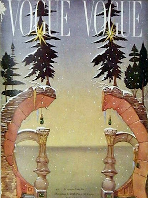
Upon all this magazine work I have been doing I had to find inspiration. Since I chose Vogue to  be my inspiration for my magazine cover redo I saw quite a bit of amazing artistry in some of the covers whilst doing my research. I then researched some of the beauty that is Vogue and their covers and put together some of my favorite covers  I saw whilst researching.

I also stumbled upon a little gem when it comes to Vogue covers, one of my favorite artists of all time Salvador Dali did a  series of covers for Vogue which included a self portrait of  Dali himself and here they are.


Friday, June 22, 2012

More Magazine work


This is a continuation of my magazine obsession. Last year we were required to construct, conceptualize and complete a  magazine in a group.We each had to do a three page spread with an article and whatever extra the magazine required I did an extra ad and a technological magazine spread  for my article.
We were required to do all our own photography for this project so I decided to use my home as a studio. go check out my Tumblr here for those photo's which are to be uploaded soon. Even though I feel 
It was my first attempt at this and I feel it wasn't to bad.


Wednesday, June 13, 2012

Retouched Magazine


Upon realizing that one day maybe working in the magazine industry could possibly a dream of mine. When we got told we had to design a magazine cover I took on this project with a hint of excitement. Also included in this project for us was to retouch a photo wherein we had to make a plus size model super skinny on Photoshop admittedly it was not my favorite thing to do because it was time consuming and because I feel it was wrong to do it without people's consent (considering this is a Google image). 

Monday, June 11, 2012

Graphical Inspiration


Some amazing inspiration found from around this here inter web but if you really wanna be picky here is where I got these from. For a  constant stream of inspiration follow me here on tumblr and sometimes I even throw in some of my own photography and stuff.

Thursday, June 7, 2012

Traditional Brand Extension


 My first project as a third year involved me doing an extension for a traditional brand. We had to research a local brand called the Nottingham Brewery company, they create home made style beers and distribute them throughout Kwa Zulu Natal and soon the rest of South Africa.

They have a very distinct and traditional style to their label design with the use of hand drawn animals with a slightly quirky look. These animals are all characters for the brand that define each different style of beer with the use of quirky names  for each beer like Pickled  Pig porter and Tiddly Toad light lager.

I did my own animal character and chose a Jaybird with the title of my beer being Jittering Jaybird. I also did some ads for the promotion of my beer.

Monday, June 4, 2012

Long Overdue

Firstly I would like to apologize for neglecting this blog for almost a year. I have been completely unaware of the stress of my final year as a graphic design student and I have moved to a student lodging which is also taking up most of my time with all my new found semi independence.

I have various blog posts lined up with a whole lot of new work that I have done. I have also within this year began using tumblr (here is the link www.madpsycon.tumblr.com) which I have found much easier to update on a regular basis but I have chosen not to neglect this blog any more.  I will try and update at least once or twice a week.

But I thank all those who view this blog and I feel it is time to get my web presence up again.

Tuesday, October 18, 2011

Iconic Redesign


We had a project to redesign an iconic brand in SA and come up with an advertising solution for the brand, we had a choice between: yum yum peanut butter; Mageau no 1; Glenryck Pilchards and Ouma rusks. I chose Ouma rusks and recreated the packaging and came up with an advertising solution of remembering your first time you had an Ouma. My Idea could be interpreted in various ways and for me was the best solution for topical advertising, I had various ideas for the slogan "Remember your first dip" was my final decision. It could have been edgy or really simple I chose to stick with simple because as a brand Ouma really isn't edgy it is a more traditional brand and maybe if need be it could be a bit tongue and cheek but not as daring as brands like Nando's. So thats is why my advertising is simple and clean.


Sunday, September 25, 2011

Graphic Inspiration


A mash up of posters, illustrations and package designs found at abduzeedo. These showcase intelligent and well done design so I found a need to share


Friday, September 23, 2011

Longboard Adverts


These were adverts that we had to do for college, we had to create long board adverts and logo for a magazine. I was stuck whether I should use the black or green stripe but personally I prefer the green stripe maybe because I kinda like the colour green that might be it or because it looks better.